
Your site’s homepage is the gateway to your artwork for nearly all of your potential audience. Think about how important this is — maybe they followed a link from another website, or maybe they found you through a Google search, but you have a precious few seconds to turn someone who’s vaguely interested in what you do into someone who wants to build a relationship with your creative work.
While getting the visitor to your site in the first place is half the battle, their experience once they click a link to visit your website is easily the other 90% (thanks, Yogi Berra!). User experience is a huge topic, but today I want to share a few simple things that can improve your home page and, of course, increase meaningful engagement with your audience. After you read this, go take a look at your website’s front page and see if you can apply any of these ideas to your site!
#1: Keep it Simple
This should be your mantra when thinking about your website, both from a content and a user experience perspective. When a visitor hits your homepage, they should know instantly what your site is about. If they didn’t already have a completely clear idea of what they want to do on your site, you should tell them with a simple, clear call to action.
Check out this home page for Kissmetrics, a website analytics company:
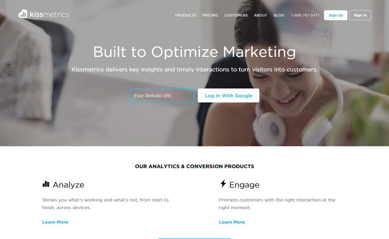
If you’ve gotten to this page, you’re probably already interested in using your website for marketing, right? Which means you probably have a website. Which means you can enter it, log in with Google Analytics, and start experiencing the wonders of their product right away.
This is simple and clear both from a user experience perspective (“If you don’t know for sure what you’d like to do, fill out this quick form!”) and from a branding perspective (“We’re so confident in our product that we’ll let you start using it in 5 seconds flat.”)
#2: Speak to your Goals
This is a corollary to #1, but it’s so important that it deserves its own list item. It’s one thing to be simple and clear, but if the ideas you express don’t work directly to achieve your artistic goals, your site will never be effective. Before you think about design, content, or anything else, you should define your goals for your website very specifically.
If you sell your artwork online, your goal is probably to sell more of your artwork to a broader audience. If you’re a performing ensemble, your goal might be to get a booking. If you run a non-profit, your goal might be donations or membership. Whatever that goal, it should be the driving force behind every decision you make on the home page of your website.
Beware the temptation to have 12 goals — remember that too many choices can be overwhelming! If you have a wide variety of artistic goals, that’s great, but be sure your website homepage speaks to the most important one or two goals.
Take a look at charity: water’s current home page design:
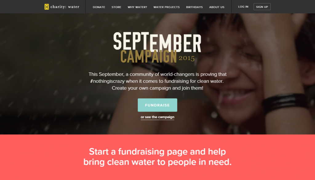
I don’t know anything about their business model, but I know exactly what their current goal is: to get people to create a fundraising campaign. This couldn’t be a better call to action — it’s concise, clear, and enticing. (And if you click the image above, you’ll see that the image behind their call to action is actually a fantastic video loop — ooh la la!)
#3: Provide an Enticing Experience
Should your homepage be visually attractive? Yes. Should it have great copy that successfully communicates your message? Yes. What often gets lost, though, is making the site enjoyable to use. If a user is having a good time on your website, they’re less likely to get distracted by that shiny “Facebook” tab next to your site in their web browser.
Take, for example, the fantastic website for the Snowbird ski resort in Utah. When you load up their site’s front page, a couple of things happen:
- You’re greeted by a great seasonal image of the mountain.
- You start thinking about the weather on the mountain, which is both very utilitarian and also an allure to start thinking about the skiing ritual. (“Oh, man, the base is getting pretty thick…can’t wait!”)
- There are subtle, fun, and appropriate animations that give you a sense of interaction with the site and brand.
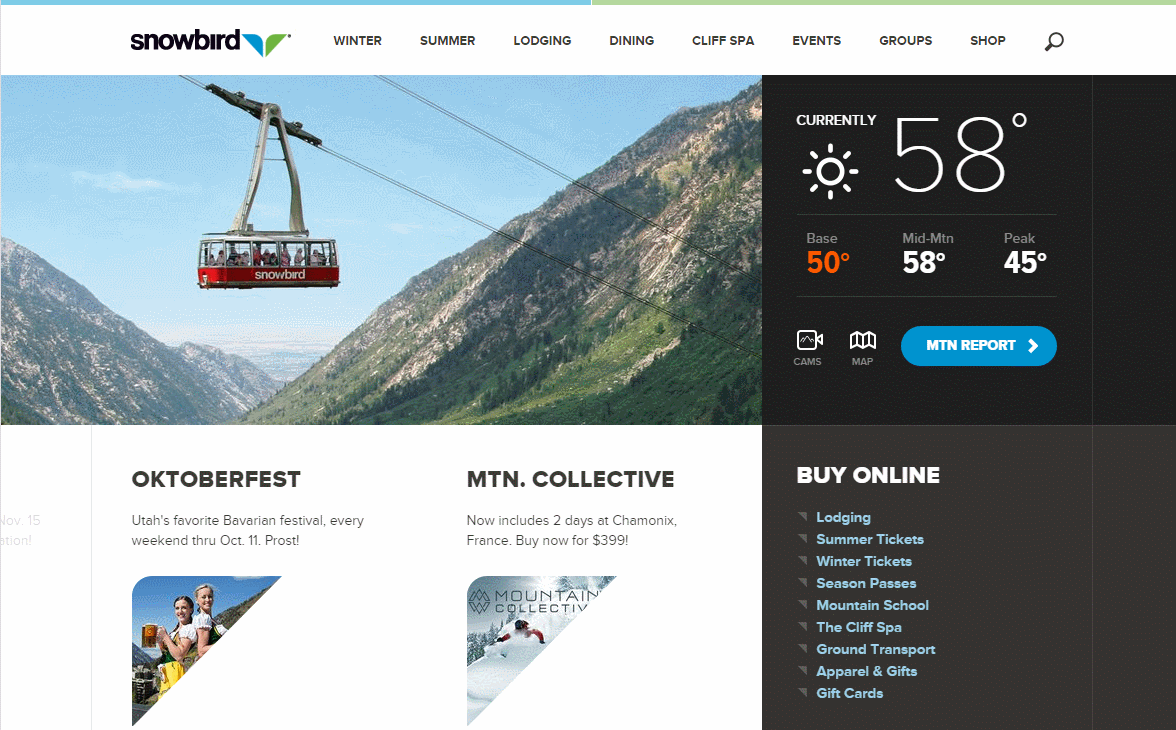
Warning: you’ve got to be careful with this one. It’s really easy to overload a visitor with overwhelming animations that don’t serve a purpose, or slow the site down to a crawl. This tip is best accomplished with the help of your friendly neighborhood web professional!
#4: Make It Bite-Sized
Your homepage is not the place for you to go into detail about where you went to school or the realization of your life-long artistic vision — you’ve got interior pages for that! On your homepage, your copy should be written to entice, not to inform.
Font sizes and weights (in a clear, readable typeface, of course!) can go a long way toward directing a reader’s eye to the most important content.
If your visitors wants to read the smaller words, they can, but if you force a visitor to read paragraphs in order to figure out what you’re talking about, they’ll probably head elsewhere (remember that Facebook is staring at them from just one tab over!).
Making use of a workhorse typeface on your homepage can be especially important if you have a lot of information you want to share. Take, for example, the homepage of the Pennsylvania Academy for the Fine Arts. Like any university, their website is a monster — it serves a lot of different types of people, and they all need something from the homepage.

Instead of paragraphs of text, though, the designers of this site did a lot of smart things:
- They broke the text up with lots of fantastic pictures, especially of people (see #5!).
- They used lots of different sizes and shapes of blocks to contain information of a particular type into one area.
- They made great use of two great fonts — look at all the different sizes, weights, and styles of two classic arty fonts (which, of course, speaks to their brand as an art school).
In combination, these three things really help to break up the page into bite-sized chunks that aren’t overwhelming and make the page fun, attractive and informative.
#5: Use Pictures of People!
Ever wonder why so many sites have pictures of people smiling happily on their homepage? It’s because the research is in — pictures of people engage other people. This is not to say that you should fill up your website with stock photos; people can tell the difference between stock photos of actors pretending to enjoy a magazine while sipping a coffee and real people engaging with real artistic events.
You don’t necessarily have to hire a professional photographer to create and hone the perfect photo for your homepage. The digital revolution means that you can take hundreds of photos yourself with an inexpensive camera and choose one that works. If you have a nice, high-end smartphone, you can even get away with using your phone to capture images of people engaging with your art. The important thing is capturing the spirit of you and your work in a high-resolution image that works with your homepage design.
For a supreme example of a website that uses each and every one of the ideas above, take a look at the Netflix homepage:
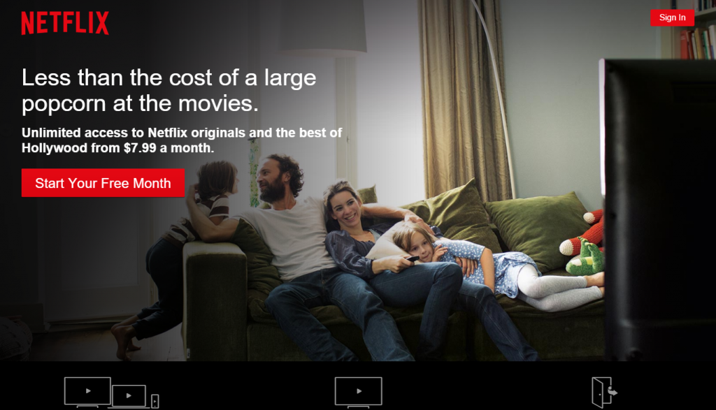
- Keep it Simple: It’s hard to imagine a more simple homepage design. Picture, title, subtitle, button!
- Speak to your Goals: What’s Netflix’s goal? Sign-ups! If you come to the site and you’re not signed in, it’s pretty clear what to do.
- Provide an Enticing Experience: Click on the Netflix screenshot above, and you’ll see that the homepage provides a warm, relaxing, inviting experience by subtly zooming and panning across photos. This subtle, relaxing experience is designed to speak to their brand. (“Curl up on the couch and relax with us!”)
- Make it Bite-Sized: The Netflix homepage takes bite-sized information very seriously. At a glance, you’ve read and understand all of the “above the fold” copy on their home page. If you do scroll down, you get three tiny bits of information about how Netflix works, but really, they do their selling through the above-the-fold experience.
- Use Pictures of People: Pictures of people are key to this homepage design. These aren’t just any people — they’re you. They’re your family. If you stay on the page long enough, you’ll see a couple of young singles appear, just in case that appeals to you more, but the very clear idea is that you can relate to people enjoying each other’s company on the couch watching some TV.
I hope this gives you a few things to think about next time you take a look at your own homepage. Remember — if you implement one or more of these changes, be sure to keep track of how your site’s performance tracks so you can tell if it’s working. Which reminds me — we’ll be back soon with a post about why analytics are important and how you can use some simple tools to measure the efficacy of your website.

Drop us a line and tell us about it.
We’d love to hear from you!